tirsdag, august 29, 2006
to much time on your hands
firefox has a nice add-on called stumble. from time to time i flick through a couple of sites. the other day i came over this bloke, guy vlosich III, and his etch-a-sketch site. i did not know if i should be impressed or thank higher powers that i did not have to spend my schooldays in special classes. nevertheless, if you have 70 hours at your disposal, an etch-a-sketch and extreme hand/eye coordination, this is how it could turn out.


well, i decided to give it a go myself, on a borrowed pocket etch-a-sketch. here is the result after 10 minutes. you be the judge.

just out of curiosity i googled guy vlosich II and guy vlosich I. i came up blank.


well, i decided to give it a go myself, on a borrowed pocket etch-a-sketch. here is the result after 10 minutes. you be the judge.

just out of curiosity i googled guy vlosich II and guy vlosich I. i came up blank.
mandag, august 28, 2006
the white wall
when i grew up in the 80s there were limited ways to get your opinion known to the world. of course, i could run around in my neighborhood with posters and stick them on lamp-posts. i could make flyers and pass them around. i could get up on a chair in a public place and tell bypassers what i really meant or i could arrange a march and paint banners with huge red letters. this was also in the early times of graffiti in norway, so i could sneak out in the middle of the night, find a blank wall, and make a "piece" on things on a kids mind. the thing is – i never did.
i did not dear to put posters on lamp-posts and i had no access to a copier for my flyers. i was to shy to speak in public places or march the streets with banners. but the graffiti piece i set out to make. i had found the perfect place for it. a huge, white and blank wall, easily seen by passing traffic for maximum exposure. i got up in the middle of the night, grabbed my spray-cans and hurried down to the wall. ten minutes later i stood in front of that, to me, gigantic wall. i shook my cans and as i was about to press the nozzle i paused. i did not know what to draw, or even write. there i stood, in the middle of the night, with the biggest blank, white wall in the entire world and i had nothing to say. i went home.
two days later someone had been there. my father and i drove past in on the way to school. "look", my father said. actually, i saw it before he did. with a thick black line somebody had drawn a big penis. with huge, red letters under the image it was written, four capitol letters only; cock.

today, peoples needs to speak their mind is growing as a result of the wast flow of information we can access through different media. the means for broadcasting yourself are limitless because of the internet. the only thing you need is a computer connected to the web. you can sit in the comfort of your home, or drop in at an internet-café anywhere in the world, and publish what ever is on your mind, an opinion or a thought, at that moment, in seconds. you can comment on anything and copy everything, download and upload, email, post and send. in addition to the "old" ways of getting your voice heard, the internet has given us a tool to reach anybody and everybody, anywhere at any time, without even lifting your ass.
according to tecknocrati , one weblog is created each second. in other words, one huge, blank and white wall each second. this means that there has been created 4.875.000 since my first humble posting in the blogosphere. tecknocrati currently tracks over 35 million blogs, and it doubles every six months.
the challenge is still the same as it was for me in the 80s - finding something smart to say, clever to write or nice to draw on my white surface. im still trying to find it. i hope you do the same.
i did not dear to put posters on lamp-posts and i had no access to a copier for my flyers. i was to shy to speak in public places or march the streets with banners. but the graffiti piece i set out to make. i had found the perfect place for it. a huge, white and blank wall, easily seen by passing traffic for maximum exposure. i got up in the middle of the night, grabbed my spray-cans and hurried down to the wall. ten minutes later i stood in front of that, to me, gigantic wall. i shook my cans and as i was about to press the nozzle i paused. i did not know what to draw, or even write. there i stood, in the middle of the night, with the biggest blank, white wall in the entire world and i had nothing to say. i went home.
two days later someone had been there. my father and i drove past in on the way to school. "look", my father said. actually, i saw it before he did. with a thick black line somebody had drawn a big penis. with huge, red letters under the image it was written, four capitol letters only; cock.

today, peoples needs to speak their mind is growing as a result of the wast flow of information we can access through different media. the means for broadcasting yourself are limitless because of the internet. the only thing you need is a computer connected to the web. you can sit in the comfort of your home, or drop in at an internet-café anywhere in the world, and publish what ever is on your mind, an opinion or a thought, at that moment, in seconds. you can comment on anything and copy everything, download and upload, email, post and send. in addition to the "old" ways of getting your voice heard, the internet has given us a tool to reach anybody and everybody, anywhere at any time, without even lifting your ass.
according to tecknocrati , one weblog is created each second. in other words, one huge, blank and white wall each second. this means that there has been created 4.875.000 since my first humble posting in the blogosphere. tecknocrati currently tracks over 35 million blogs, and it doubles every six months.
the challenge is still the same as it was for me in the 80s - finding something smart to say, clever to write or nice to draw on my white surface. im still trying to find it. i hope you do the same.
tirsdag, august 22, 2006
larger and smaller than life
i came over the artist, ron mueck, while flickering through a book at a friends house. i was stuck by the extreme realism in details and form, depicting ordinary humans, in everyday situations. the twist; they are all bigger or smaller than real life. you will not find these at madame tussauds (thank god).
here are a few examples on his work.

a girl, 2005 mixed media.

two women, 2005 mixed media.
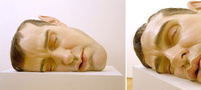
mask II, 2001 mixed media. (self portrait)

in bed, 2005 mixed media.

spooning couple, 2005 mixed media.

wild man, 2001 mixed media
all pictures from flikr (tagget with "ronmueck").
more on the artist at wikipedia.
ron mueck (1958-)
After having worked in children's television, motion picture special effects, and advertising for twenty years in Australia and Great Britain, in the early 1980s Ron Mueck moved to London and became a professional model maker for Jim Henson's Muppets. In 1996 he started doing fine art. He had no formal education.
here are a few examples on his work.

a girl, 2005 mixed media.

two women, 2005 mixed media.

mask II, 2001 mixed media. (self portrait)

in bed, 2005 mixed media.

spooning couple, 2005 mixed media.

wild man, 2001 mixed media
all pictures from flikr (tagget with "ronmueck").
more on the artist at wikipedia.
fredag, august 18, 2006
him & her
what are you thinking about?
nothing.
you have to think of something. its not possible to think on nothing.
i can, sometimes.
tell me!
what?
what is on your mind?
different things.
like?
im thinking about that little dot on the ceiling.
are you thinking about me?
i am.
yes?
nothing special - on you, i general.
nothing special?
not really.
what are you thinking about now?
im thinking about the things we are talking about right now.
and?
tirsdag, august 15, 2006
signs of the times

produced by pleix. music: bleip. 2001.
a comment on things we find beautyful in our world.
click on image to see the movie.
more movies at pleix.
happy birthday, paul

paul rand (1914-1996)
one of the 20th centuries most influential graphic designers and visual communicators.
read more on the web about mr. rand.
lørdag, august 12, 2006
"that looks nice, but how much is it?
in 1969, the head designer at nrk (the norwegian broadcasting corporation), ingolf holme, designed the nrk-logo. two years later carolyn davidson created the "nike" logo, also refferet to as the "swoosh".

for as long as i can remember, i have always known of these two brands. in over a decade, the nrk was the only television-channel in norway, in norwegian and my first set of "real" sports-shoes was a pair of nike.
both nike and nrk has always been on of my favorite corporate brands. mostly since the image of the logo activates good associations and feelings experienced over time, from the envious glances at my feet from the other kids in the neighborhood to the childrensprogram about a bear named "kolargol" and an evil circus-manager. but also because of their graphic shape - a sort of simplicity towards what they represent and what they are designed to express.

the first line of nike footwear is introduced in 1972.

screenshots from the nrk.
for the nrk-logo, mr. holme was paid NOK 3000,- ( approx. $450 USD). ms. davidson submitted a bill of $35 USD for her work. time passed on, and the two brands grew. in the late 60s and early 70s no one knew what sort of impact these brands would have on the marked in 2006. today nike has become one of the biggest producers of athletic shoes, sports equipment and accessories and employing over 26.000 people worldwide. the nrk is the major broadcasting institution in norway with nine radio channels, two TV channels with an approx. 100% national coverage and is the workplace for 3425 people (2005).
In 1983 ms. davidson received a gold "swoosh"-ring from phil knight (founder) and an envelope filled with Nike stock to express his gratitude. on the other hand, in 1997, during the nrks launch of its second channel, they placed an "1" behind the already exiting nrk-logo. mr. holme objected to this and argued that it could not be changed without his approval. the argument ended up in court and mr. holme and the nrk agreed on a settlement for NOK 200.000 (aprox. $ 35.000). now they could do what they wanted and ingolf holme agreed to stay away.
here we have two different views and outcomes, on two identical tasks. the task of giving a business an emotional tag, the logo, and how much its designer is appreciated. mr. knight did not have to pay, or give, carolyn davidson anything, but he did. the nrk could just have asked ingolf holme for approval, or even help, they did not.
i am not into the economy of things, the corporate business plans of the world, the strategic meetings in noumerous boardrooms across the globe and i dont wear a suit and a tie to work. im a simple creative of original ideas, a creator of emotion through sight and visual and verbal expressions. i work with my heart. the maths i leave to somebody else.
in all fairness, a brand logo is worthless, and even hurtful to its companies, if the content associated to the logo does not have the quality expected by the marked. but that is not the responsibility of its designer.

the nrk-logo after the inplementation of the "1".

a pair og nike-shoes today.
-----
the nike logo is from nike.com
the nrk logo is from nrk.no
screenshots is from tv ark
picture of nike shoe is from genealogy of speed

for as long as i can remember, i have always known of these two brands. in over a decade, the nrk was the only television-channel in norway, in norwegian and my first set of "real" sports-shoes was a pair of nike.
both nike and nrk has always been on of my favorite corporate brands. mostly since the image of the logo activates good associations and feelings experienced over time, from the envious glances at my feet from the other kids in the neighborhood to the childrensprogram about a bear named "kolargol" and an evil circus-manager. but also because of their graphic shape - a sort of simplicity towards what they represent and what they are designed to express.

the first line of nike footwear is introduced in 1972.

screenshots from the nrk.
for the nrk-logo, mr. holme was paid NOK 3000,- ( approx. $450 USD). ms. davidson submitted a bill of $35 USD for her work. time passed on, and the two brands grew. in the late 60s and early 70s no one knew what sort of impact these brands would have on the marked in 2006. today nike has become one of the biggest producers of athletic shoes, sports equipment and accessories and employing over 26.000 people worldwide. the nrk is the major broadcasting institution in norway with nine radio channels, two TV channels with an approx. 100% national coverage and is the workplace for 3425 people (2005).
In 1983 ms. davidson received a gold "swoosh"-ring from phil knight (founder) and an envelope filled with Nike stock to express his gratitude. on the other hand, in 1997, during the nrks launch of its second channel, they placed an "1" behind the already exiting nrk-logo. mr. holme objected to this and argued that it could not be changed without his approval. the argument ended up in court and mr. holme and the nrk agreed on a settlement for NOK 200.000 (aprox. $ 35.000). now they could do what they wanted and ingolf holme agreed to stay away.
here we have two different views and outcomes, on two identical tasks. the task of giving a business an emotional tag, the logo, and how much its designer is appreciated. mr. knight did not have to pay, or give, carolyn davidson anything, but he did. the nrk could just have asked ingolf holme for approval, or even help, they did not.
i am not into the economy of things, the corporate business plans of the world, the strategic meetings in noumerous boardrooms across the globe and i dont wear a suit and a tie to work. im a simple creative of original ideas, a creator of emotion through sight and visual and verbal expressions. i work with my heart. the maths i leave to somebody else.
in all fairness, a brand logo is worthless, and even hurtful to its companies, if the content associated to the logo does not have the quality expected by the marked. but that is not the responsibility of its designer.

the nrk-logo after the inplementation of the "1".

a pair og nike-shoes today.
-----
the nike logo is from nike.com
the nrk logo is from nrk.no
screenshots is from tv ark
picture of nike shoe is from genealogy of speed
its simple, its nintendo
since my father was a sailor, and travelled the world, he always came home with things long before they they were common in norway. one day, in the early 80s, my father came home with the "game & watch, parachute". then hours became minutes. during the course of that decade, i got more of them. i think that at some point i had about five different ones. unfortunately, they are now all gone. (ref. previous post: "searching for time")

two week ago i bought the nintendo ds lite. to my surprise and absolute joy, it looked exactly the same as it did 25 years ago. they had not filled it to the rafters with an mp3 player, a movie player or a internet hook-up. it could not be used as a camera or a phone. it was still what it started out as - a fun, simple and easy game console. nothing more. nothing less. its industrial design at its finest. it even had the alarmclock.

pictures from game&watch and myself.

two week ago i bought the nintendo ds lite. to my surprise and absolute joy, it looked exactly the same as it did 25 years ago. they had not filled it to the rafters with an mp3 player, a movie player or a internet hook-up. it could not be used as a camera or a phone. it was still what it started out as - a fun, simple and easy game console. nothing more. nothing less. its industrial design at its finest. it even had the alarmclock.

pictures from game&watch and myself.
tirsdag, august 08, 2006
the FLOW™
this summer i went to copenhagen with my girlfriend. during my segment "private big city walking time" i visited the "danish design center" (ddc) at HC Andersens Boulevard to see the FLOWmarked. FLOWmarked was created 2004 by mads hagstrøm (founder and FLOWdirector), as a supermarket selling consumer awareness. its an actual supermarked where you can buy the "products" off the shelf. at the moment there are about 40 or so products for sale.


a collection of some of the 40 or so different products.

visit the theFLOWmarket. they even have a webshop. you know, shopping helps.
i myself bought:
a tincan of "meaningfullness"
a tincan of "collective consciousness"
a 1/1 "one minute of reflection"
a 1/4 of "unconditional love"
a pillbox of "choice makers"
a pillbox of "pause"
a pillbox of "presence"

theFLOW™ is a brand and template that meets the rising demand for sustainable innovation. Throughout the 20th century the pursuit for technological and economic progress has given the industrialized world great new possibilities but has also resulted in a wide range of imbalances and challenges on 3 levels:
The individual - man’s relation to oneself:
(rising stress- depression- and obesity curves, addictions, eating disorders, symptom treatments etc.)
The collective - man’s relation to society:
(over-consumption, increasing fear, xenophobia, global inequality, cultural rectification, conflicts over resources etc.)
The environmental - man’s relation to nature:
(pollution, agricultural toxics, factory farming, decreasing biodiversity, non renewable energy consumption etc.)

a collection of some of the 40 or so different products.

visit the theFLOWmarket. they even have a webshop. you know, shopping helps.
i myself bought:
a tincan of "meaningfullness"
a tincan of "collective consciousness"
a 1/1 "one minute of reflection"
a 1/4 of "unconditional love"
a pillbox of "choice makers"
a pillbox of "pause"
a pillbox of "presence"
mandag, august 07, 2006
my mom on a cake

photo: sony ericsson W800i. sløvika camping, saturday august 7th., 2006.
previous post: my nephew on a cake.
indoor panorama


photo: sony ericsson W800i. panoramic function.
inside room nr. 28 at the firgrove hotel, blackpool, england.
onsdag, august 02, 2006
there is something on the melon

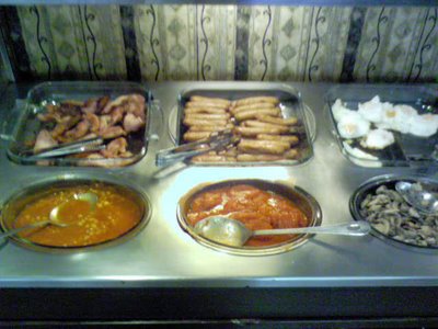
well, as the temperature i oslo peaks at 30 C, the need for water is essential. so, if you are on vacation in oslo at this moment, , thirsty, little hungy and nothing to do, bye a melon. then flick out your swiss army knife (alterative; your nails) and find a place in the shade. more inspiration here.



 Stumble It!